Thursday, February 1, 2024
Designing for Enlightenment
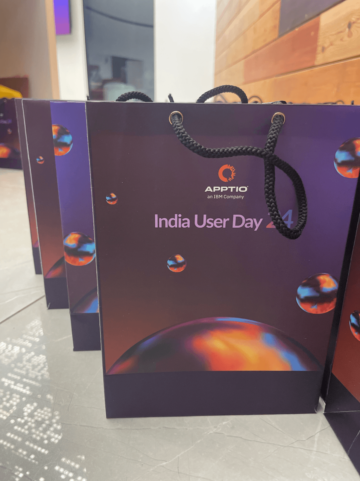
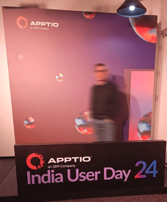
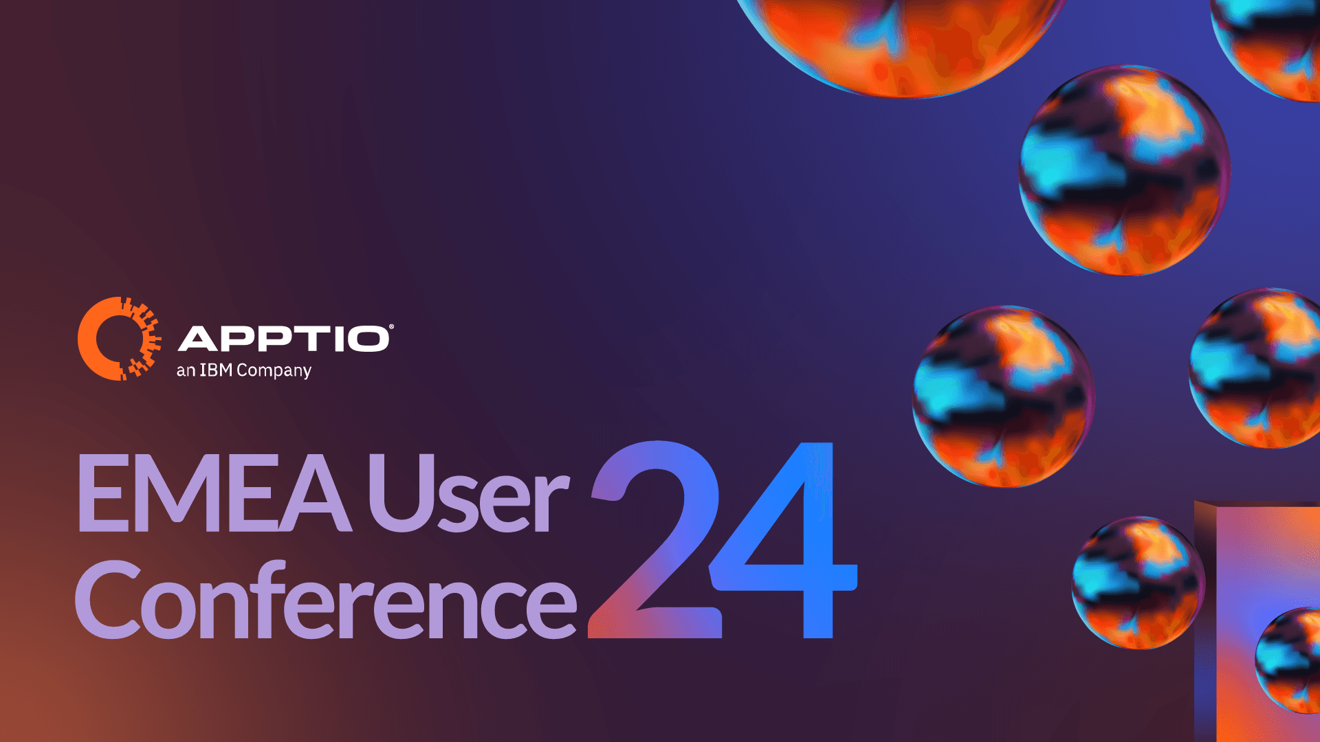
The core idea behind the EMEA User Conference 2024 design was "enlightenment through technology."
The visual metaphor?
A portal — symbolizing the journey every Apptio user takes toward mastering technology investments. Abstract spheres float within a gradient-lit space, suggesting ideas, innovation, and momentum.
This theme was consistent across EMEA, APAC, and India events — creating a unified global narrative.
The Color Language


Tech, Energy & Possibility
The palette strikes a balance between corporate sophistication and energetic transformation.
- Deep purples signify expertise and authority
- Vibrant oranges capture excitement and creativity
- Electric blues convey trust and progress
- Gradients bridge these emotions — reflecting the journey from uncertainty to clarity
Each color was carefully chosen to speak to the duality of stability and innovation — a reflection of Apptio’s brand promise.
Core Assets - Designed for Consistency & Impact
Deliverables spanned across multiple touchpoints — ensuring brand consistency both digitally and on-ground.
Category:
Event Branding and Execution
Client:
Apptio
Duration:
8 Months
Location:
London, Sydney, Bengaluru